We’re very proud of our recent integration with Microsoft’s Power BI, and here’s why:
If you think of yourself as the captain of the ship that is your business — in fact, if you’re anywhere near the helm — a business intelligence system gives you the dashboards you need to steer the craft.
You don’t want to be trawling through the data details of your exact coordinates every second. You want to see the trends that tell you where you’re going, so you can adjust your course into favorable winds and currents as you travel.
The status of the report, Commander
Synergy’s reporting is reasonably sophisticated — it can report on pretty much everything in the system. It’s great at traditional, tabular-style, real time data extracts. The thing is that it’s all very traditional, tabular-style reporting. It’s pages full of numbers, which your accountants love. They get all excited about those digits. However, some people (not mentioning any names) look at a page of numbers and the shutters in their minds slowly go down (me).
Synergy’s reporting engine can produce an amazing array of reports, with an incredible amount of detail. And our software does that in a very traditional reporting kind of way. Which is to say, you run this report, Synergy produces it as a PDF that you email to somebody, or you print it, and scribble on it, and take it to your meeting. Perfect for its purpose. You get a snapshot of your business data at a point in time. It’s very static. It’s exact business data at the time that you printed it. Which is useful.
There’s data on the starboard bow
People love their reports, they really do. Especially your CFOs. And I’m certainly not judging them. It just has certain limitations when it comes to using that information to make good decisions. And that’s where BI comes in, my friends.
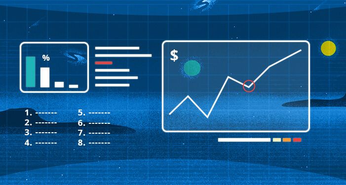
BI is short for, ‘business intelligence’ and it’s a system that takes vast sets of numbers and turns them into something from which you can make a decision. It takes your business numbers from being data to being information. A page full of numbers is data, whereas if something you can look at, that tells you something, is information. For most people, a simple example of this is turning data into a graph.
Imagine you’re looking at a table full of numbers showing your staff utilization, month by month for the last three months, and you’ve got 12 months’ worth of data, and 100 staff — now you’ve got 1,200 numbers on the screen. Now imagine trying to make sense of that.
Now imagine it’s given to you in a graph that shows the sum of everybody’s utilization, or the average utilization. You can say, “Oh look, yeah, everybody was really busy in the middle of the year, and it’s gone a bit quiet towards the end of the year.” It’s just so much easier for humans to see those trends, when they’re shown in a graph. So, graphs are good. We love graphs, Captain! And again, Synergy’s already got the ability to export your reports into Excel, and you can turn it from a table of numbers on a printed page to a table of numbers in Excel, and then you can graph it in Excel. So that’s all good too. A lot of our customers love their graphs in Excel. Again, zero judgement.
How on Klingon does BI differ?
In Synergy:
- We store our data in a way that’s specifically designed to have multiple people doing transactions in the system
- Our software is focused on making it efficient for people doing things with data
BI copies data out of Synergy — on a schedule — and the BI system:
- Doesn’t care about doing things, it only cares about reporting on things
- BI software is focused on doing clever things with that data to make really fast, graphical reports.
With a report out of Excel, if you want to look at the data differently you’ve basically got to rerun the report somehow. Whereas BI is very good at being interactive. Very good indeed.
With BI you can do things like in one graph tell it to show you the average utilization of your staff. And you can see, “Oh, look, it was really busy in that month.” No biggie, really. But then, if you click on that month, you can build your BI report to show you, for example, a graph of all the people in that month and how utilized they were. You can start off with a high-level report and drill into it to see more detailed information.
It’s like a 3-dimensional version of reporting — in all sorts of different ways. And you can build your standard filters into the report page, so it becomes even less like a static report, and more of a customized reporting tool for your specific company. We know, it’s so Star Trek it’s dazzling!
On a specific report, you can tell it to give you a list of your offices, give you a list of your disciplines, or the people that run the different departments. And then, when you’re looking at the report, if you click on Sydney, for example, and in an instant, it redoes the graph just for Sydney. You might then go, “Oh, well let’s do it for Sydney, and for the interior design discipline.” And so you just click on the interior design discipline, and now it’s redone the data just for that. The interactivity enables you to look at the data and get a better understanding of what’s going on immediately. I don’t want to lie, it’s awesome.
And when somebody says, “Why was profit down in July?” You can go, click, click, click, click, “Oh, look, we took a bath on this particular job.” You’d have to have reams of printed reports to be able to do that, if you were doing it with printed reports. But doing it with a well-designed BI dashboard, you can do that live and on the fly.
Mark my words, in the future, it’ll be much more like Star Trek with people walking around with their virtual iPads, and a little less like the 1950s, with people with reams of tractor-fed paper.
It’s live, Jim, but not as we know it
We’ve been asked if BI is live-linked to Synergy, if it’s continuously updating. Like I said, the data has to be copied from a database in Synergy which is made for doing transactions, into a database in BI which is for reporting on transactions. So, they’re designed very differently in the back end of these applications. If you try and do BI’s kind of reporting out of our database, it’ll always be slower because our database isn’t designed for the reporting, it’s designed for the doing.
Secondly, and probably more importantly, the data in BI needs to be fresh, but it doesn’t need to be live. If we made this 100 percent synchronized with Synergy, the data would still be out of date because all your staff don’t fill in their timesheets as they work each minute. Expenses aren’t up to date until end-of-month.
So how up to date do you want it to be? We’d say, for the purposes of doing business analytics, getting it updated nightly is actually as close as you want to get. We recommend that you refresh it overnight, so that when you come in the next day you’ve got today’s version of the data, and you know that this is up to date as of midnight last night.
Because you’re not meant to be using this tool for checking if Mary did her timesheets yet. That’s not what it’s for. What it’s really for is business intelligence. It’s for making strategic, evidence-based decisions about your whole business. You’re supposed to be steering the spacecraft with it.
Put ‘er into (financial) warp speed
The sort of trends you’re going to be looking for with BI are:
- Which customers are the most profitable?
- Which kind of projects do we make the most money out of?
- Which disciplines are most lucrative for us?
- What’s making the money in which locations?
- If I’ve got somebody who generally works on hospitals, are they as effective when I put them on a school job?
Alerts, Spock, not alarmed
The icing on the Vulcan here is this — the BI tool also has some alerts you can build in. You can do things like build a BI dashboard that tracks the project-by-project budget versus actuals for the business. You can set KPIs, and you can set alerts that email certain people if a condition arises. That condition might be, say, if a project now has costs that are over budget.
It then becomes not only an interactive tool for you analyzing your data, but you can also have it as a passive tool that is sitting there, watching your data and sending you alerts when the conditions that you specify are raised. Boom!
Waving from the platform — happy stellar travels ahead
The Power BI integration with Synergy works via an API. It’s a great example of the direction our software is headed. We see ourselves as a data platform, and we welcome people who want to attach other apps to Synergy.
In the process of your normal working day as a Synergy user, you’re generating data. That data is then fed via, in this case an API, straight into a BI tool. And the one we mostly work with is Power BI, because people have a certain amount of licensing that comes with Microsoft.
It’s a good example of how the API can connect your Synergy project and practice management tool with a very sophisticated, but easy to use and wonderful tool like Power BI. But there’s a heap of different BI tools out there, and they’re all very good. You just pick the one that suits you best.
And then you take off like a rocket towards #MoreTimeForDesign.
Watch the webinar — Power Business Intelligence (BI) — turning data into business insights