At Total Synergy, we believe architects and engineers drive impact and progress. Their work shapes skylines, transforms spaces, builds the world in which we all live in, and brings bold visions to life—and they deserve a partner whose identity reflects their ambition.
This is why we’ve reimagined Total Synergy.
With a fresh logo, an enriched color palette, improved fonts, purposeful imagery, and more, our new brand reflects not just who we are but how we serve our customers. This isn’t simply a new look—it’s a commitment to always deliver software that helps architects and engineers to become the best they can be.
We’re excited to unveil the new Total Synergy. Now let’s explore how every design decision was made with engineers and architects in mind.
Our Evolution Toward a Seamless Brand Experience
Over the years, as we’ve evolved, we’ve embraced different design phases—from black-and-white simplicity to playful illustrations and even AI-generated experiments. But while those efforts were impactful in their own right, they lacked one thing: consistency.
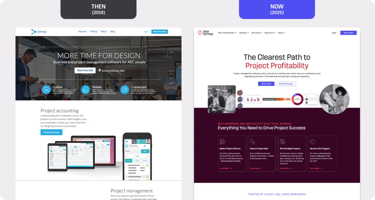
Our rebrand addresses this head-on. We’ve built a unified identity that ensures every touchpoint—whether it’s a blog post or our product interface—feels cohesive and familiar. Why? Because your experience matters.
When you work with Total Synergy, you should feel like every step speaks the same language.
A New Logo for Designing What’s Next
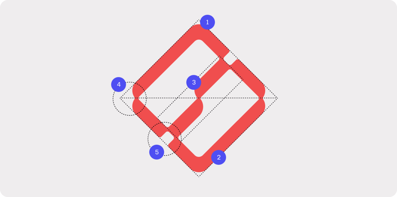
Logos are more than the face of a brand. They’re the shorthand for who we are and what we stand for. Our new logo reflects the very essence of Total Synergy.
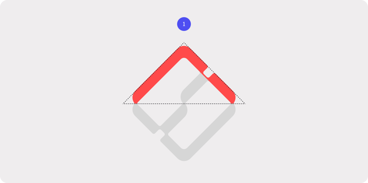
1. A Foundation of Strength
The triangle, the strongest geometric shape, is foundational to our logo. Its inability to deform without altering its sides symbolizes resilience and the ability to withstand pressure and stress.
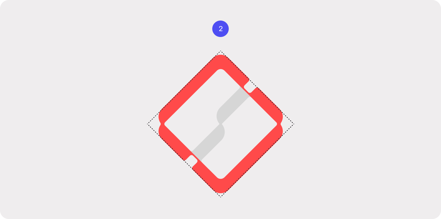
2. The Diamond Shape
The logo’s diamond shape is formed by merging two triangles, representing the dual focus of our platform: project management and project finance. Together, they reflect the integration of these essential aspects. Plus, diamonds are pretty.
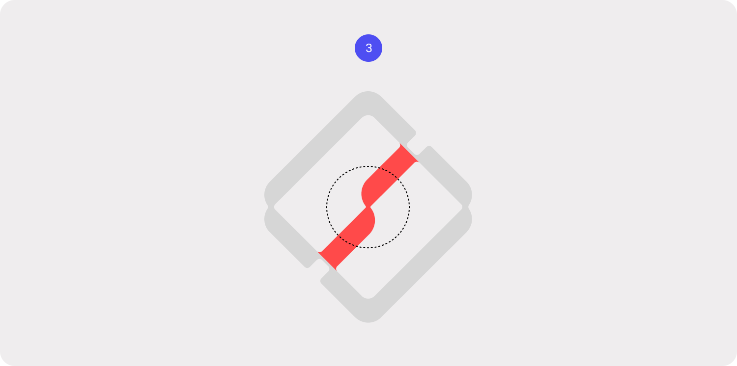
3. The S Curve
At the center, the S curve unites project management and project financials, with project analytics. It represents growth and synergy, with its upward trajectory echoing progress and success.
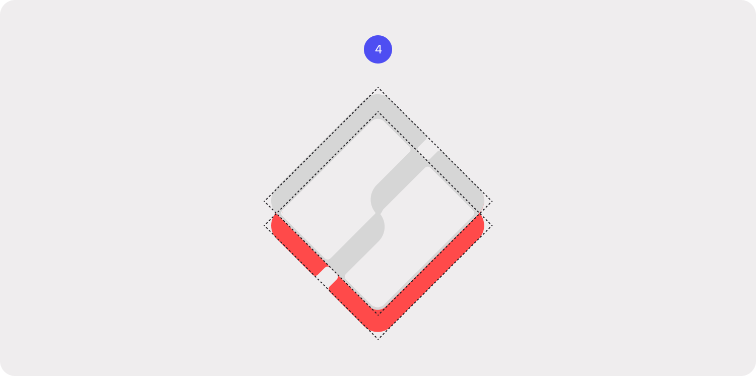
4. Dimension and Growth
The overlapping framing shape introduces subtle dimension, giving the mark a sense of rising upward. This design mirrors the growth, building, and creation that architects and engineers bring to life daily.
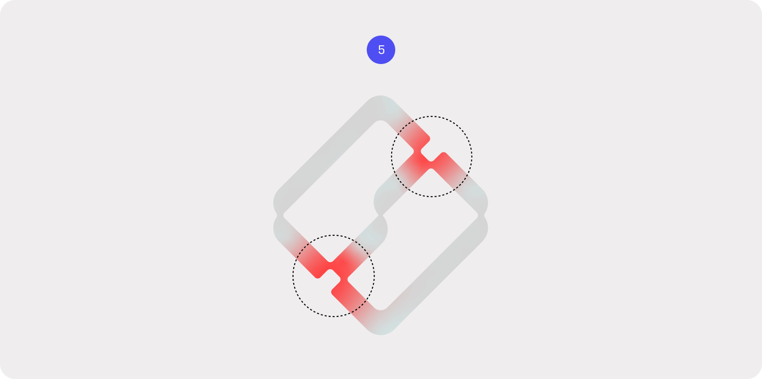
5. A Constructed Precision
Clipped corners with flat edges lend the logo a sharp, precise, and constructed appearance, evoking the meticulous craftsmanship central to the A&E profession.
A Typeface That Honors Design Excellence
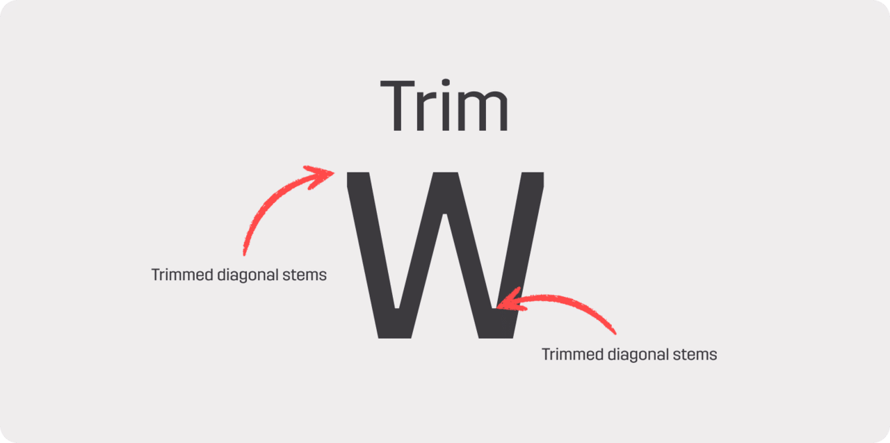
Typography is the unsung hero of design, quietly shaping how a brand is perceived. For Total Synergy’s rebrand, we sought a typeface that could embody the precision, creativity, and craftsmanship of the architects and engineers we serve. The result is Trim, a typeface inspired by the work of Danish architect, printer, and designer Knud V. Engelhardt (1882–1931).
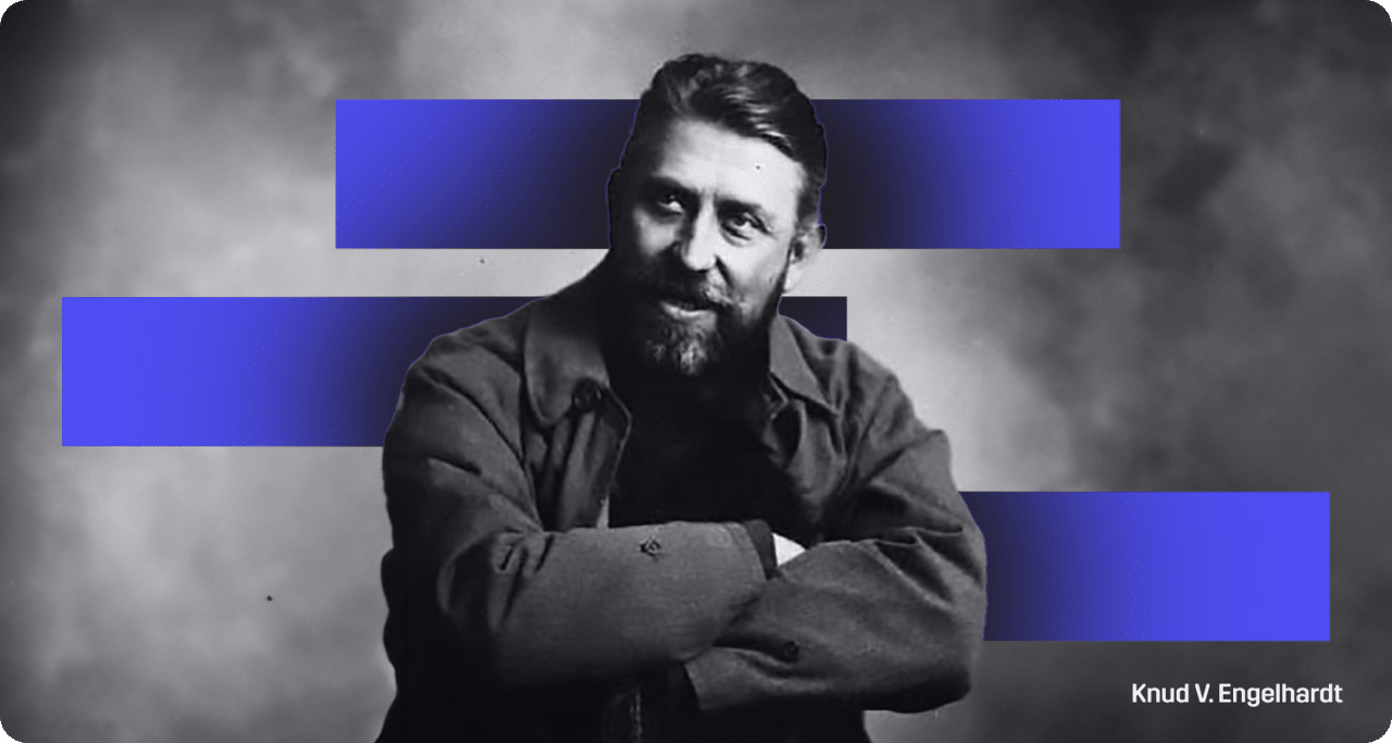
Engelhardt’s influence is unmistakable. His innovative approach to trimming diagonal stems has shaped modern typography, and Trim draws on this legacy to deliver a unique and memorable aesthetic. By extending this trimming concept across all letterforms, the typeface achieves a refined and cohesive look that resonates with the meticulousness of design and engineering.
Trim feels as though it comes straight from a drafting table, making it a perfect fit for the industries we support.
Colors That Break the Mold
In the SaaS world, blue dominates. It’s the safe, trusted choice—but it’s everywhere. To differentiate ourselves, we chose a palette that feels sophisticated, bold, and uniquely tailored to architects and engineers.
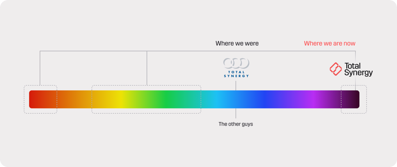
Our Colors
1. Carbon and Wine: Grounded, professional, and rich, these colors exude trust and sophistication.
2. Coral and Brick: Warm and vibrant, these hues inject humanity and optimism into our palette.
3. Primary Blue and Green: Clean and tech-forward, they remind us of our SaaS roots while complementing the boldness of our core colors.
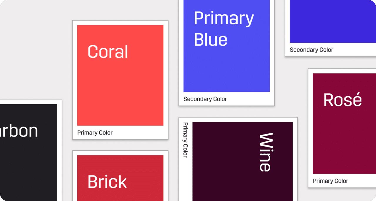
When comparing our palette to competitors, it became clear that no one else uses colors this way. Interestingly, in our research of architecture and engineering firms, tones like wine and brick appeared frequently, affirming their connection to our audience. By embracing these hues, we reflect the aesthetic preferences of the industries we serve.
Our new color palette is more than a visual shift—it embodies who we are and what we stand for. Each color was thoughtfully chosen to create a dynamic, inviting experience that balances boldness with warmth. The primary shades provide a strong, steady foundation, while the accents add energy and modernity. Together, they capture the creativity, precision, and innovation that define our customers in the A&E community.
Reflecting Simplicity and Growth in New Design Elements
As part of our new branding, we’ve introduced visual elements that reflect the principles of architecture and engineering—precision, structure, and growth. These elements aren’t just for aesthetics, they’re carefully designed to tell a story of how Total Synergy supports our customers’ work.
Streamlines
Flowing lines represent the projects our customers manage daily, each one moving forward and converging at a single point: Total Synergy. These lines illustrate how our platform simplifies complex workflows, helping practices achieve clarity and efficiency.
Rising Building
Layered linear forms evoke the image of buildings rising from data, symbolizing the growth and progress Total Synergy empowers. These shapes represent the momentum we help create, driving our customers’ projects forward with precision, clarity, and purpose.
Logo Mark Blueprint
This blueprint motif strengthens our connection to the design and build industries, reflecting the technical precision and meticulous planning that shape our customers’ work every day.
Imagery That Captures the Heart of Architecture and Engineering
Imagery is more than decoration—it’s storytelling. And our new approach to visuals places our customers at the heart of that story.
Integrated UI Elements
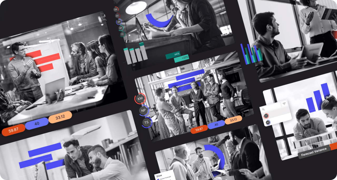
Each image combines grayscale photography with layered graphics, such as bar charts, dashed lines, and S curves. These elements aren’t just added—they’re integrated into the scene, creating depth and dimension. It feels like the data is part of the moment, much like how our platform integrates seamlessly into our customers’ workflows.
Sophistication in Simplicity
Keeping the base imagery black and white allows the pops of coral, wine, and blue to shine. This contrast mirrors the clarity we aim to bring to projects.
Architectural Precision
The dashed lines resemble the swishes of an architect’s pen, while cascading shapes evoke a building rising from data—symbolizing how we help you bring ideas to life.
Simplifying Your Journey with a Redesigned Website
Our new website isn’t just a place to learn about Total Synergy, it’s designed to meet you where you are. Whether you’re a business owner, a project manager, or a finance leader, we’ve created dedicated pages tailored to your needs.
Pages Tailored to Every Role of an A&E Practice
Each role within an A&E practice has its own dedicated space, with content, messaging, and tools designed to address the unique challenges and goals of business owners, finance leaders, operations, and project managers.
Clear Solutions for Every Stage
From the moment a project begins to its completion, our updated product and solution pages take you through the process, showing exactly how Total Synergy supports your workflows.
Why Total Synergy
Our revamped “Why Total Synergy” page highlights the unique value and benefits we provide, helping you understand exactly why we’re the right partner for your practice.
Seamless Navigation
Enhanced menus and an updated site structure ensure you can quickly find the information you need, whether you’re just exploring or ready to get started with our tools.
How This Impacts Our Customers
Our customers will notice our new visual identity across all touchpoints, from our platform interface to our website and communication materials. These updates are designed to enhance their experience, providing a clean, intuitive, and professional look that aligns with the workflows they rely on every day.
Beyond the visual updates, our goal is to make every interaction with our platform feel seamless and aligned with our customers’ needs. From simplified navigation to clearer communication, these changes aim to make their day-to-day work easier, saving time and helping them focus on what they do best: designing and engineering the future.
What’s Not Changing
While our look has evolved, our mission remains the same—to be the backbone of successful architecture and engineering firms. We are committed to fostering long-term partnerships, enhancing our offerings to meet industry needs, and supporting our customers’ growth and success at every step.
The Future Is Bright
This is just the beginning of an exciting new chapter for us. Our new brand represents growth, connection, and a deeper alignment with the architects and engineers we proudly serve. As our customers take on new projects and navigate evolving challenges, we are committed to being their trusted partner every step of the way.
We’re excited to embark on this journey together. Let’s continue shaping a future defined by innovation, precision, and remarkable achievements.
Go explore our website to experience the rebrand in action and discover how we’re continuing to support your success.

